Expanding a delicious world.
This project for Alpina, one of Colombia's leading dairy brands, focused on developing unique brand assets for its corporate identity, with the objective of strengthening its connection with consumers while maintaining its fresh, young and accessible brand essence. As opposed to redesigning its entire visual identity, the work focused on enriching the corporate brand with unique elements that reflect its approachability and warmth.
Although Alpina is a well-established brand, it faced the challenge that its corporate identity was starting to lose distinction due to the shared use of visual assets with its sub-brands and product portfolio. It was crucial to develop specific assets that would not only differentiate the corporate brand in the marketplace, but also respect and amplify its friendly and approachable brand image.
The project generated brand assets specific to the corporate brand, including a new typography and color palette that align with Alpina's young and dynamic spirit. These elements were designed to be used exclusively in corporate communications, ensuring that each visual touch reinforced the brand's refreshing and accessible personality.
The new brand assets were created to be clear and friendly, making them easy to adopt in all communications and helping Alpina maintain a strong emotional connection with its audience. In addition, detailed guidelines were established for the use of these assets, ensuring consistency and coherence across the business group.
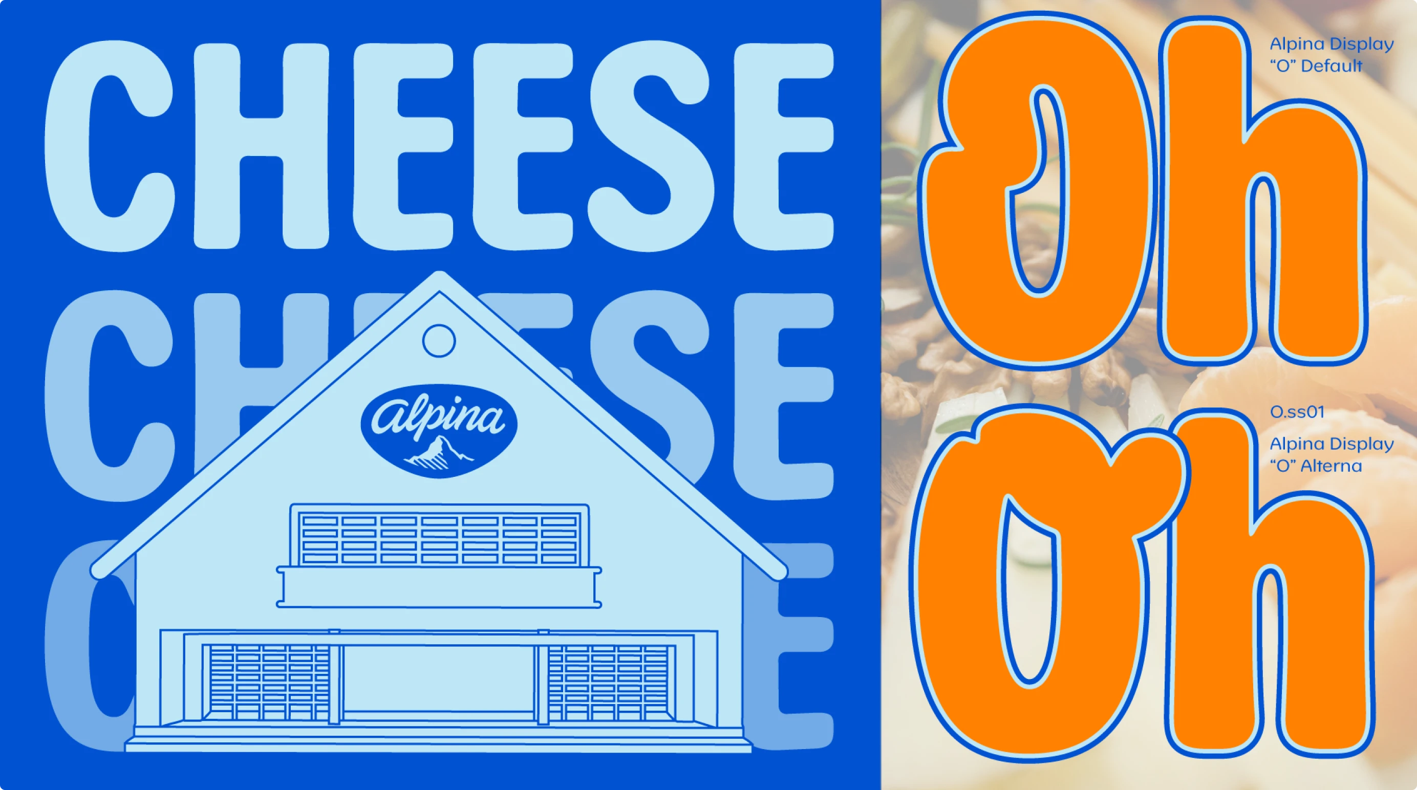
An essential part of the brand assets project for Alpina was the creation of the Alpina Display typeface, designed specifically to reflect the brand's values: taste, fun and delight. This typeface, which was developed from scratch, acts not only as a vehicle for text, but also as a vital graphic resource, enriching Alpina's visual universe with a distinctive and versatile presence.
Alpina Display and the new graphic elements are based on the evolution of Alpina's medallion, which has historically been the brand's main visual asset. This medallion was transformed into a modular element that now inspires new shapes and patterns, allowing the creation of a coherent and flexible design system. This modular system allows Alpina's teams to combine visual elements in innovative ways, ensuring that brand coherence and consistency is maintained across all communications.
This approach provides Alpina with a dynamic and adaptable branding toolkit, ensuring that each customer touchpoint reflects the brand's core values in a fresh and engaging way, without losing identity or visual consistency.
The introduction of proprietary brand assets significantly improved the clarity and cohesion of Alpina's corporate identity, allowing the company to effectively communicate its industry leadership without losing its warm and approachable essence. This approach not only strengthened Alpina's corporate image, but also reinforced its commitment to being a brand that consumers feel close to and trust.


