

An icon takes flight again.
The Aguila Imperial packaging redesign project focused on revitalizing the image of this premium beer, which used to be launched only at Christmas. Aguila Imperial has been for years a tradition in the Colombian holidays, representing a product of high quality and premiumness. Through a visual approach that highlights its exclusive character, we sought to update its identity without losing the essence of what has made it a national icon.
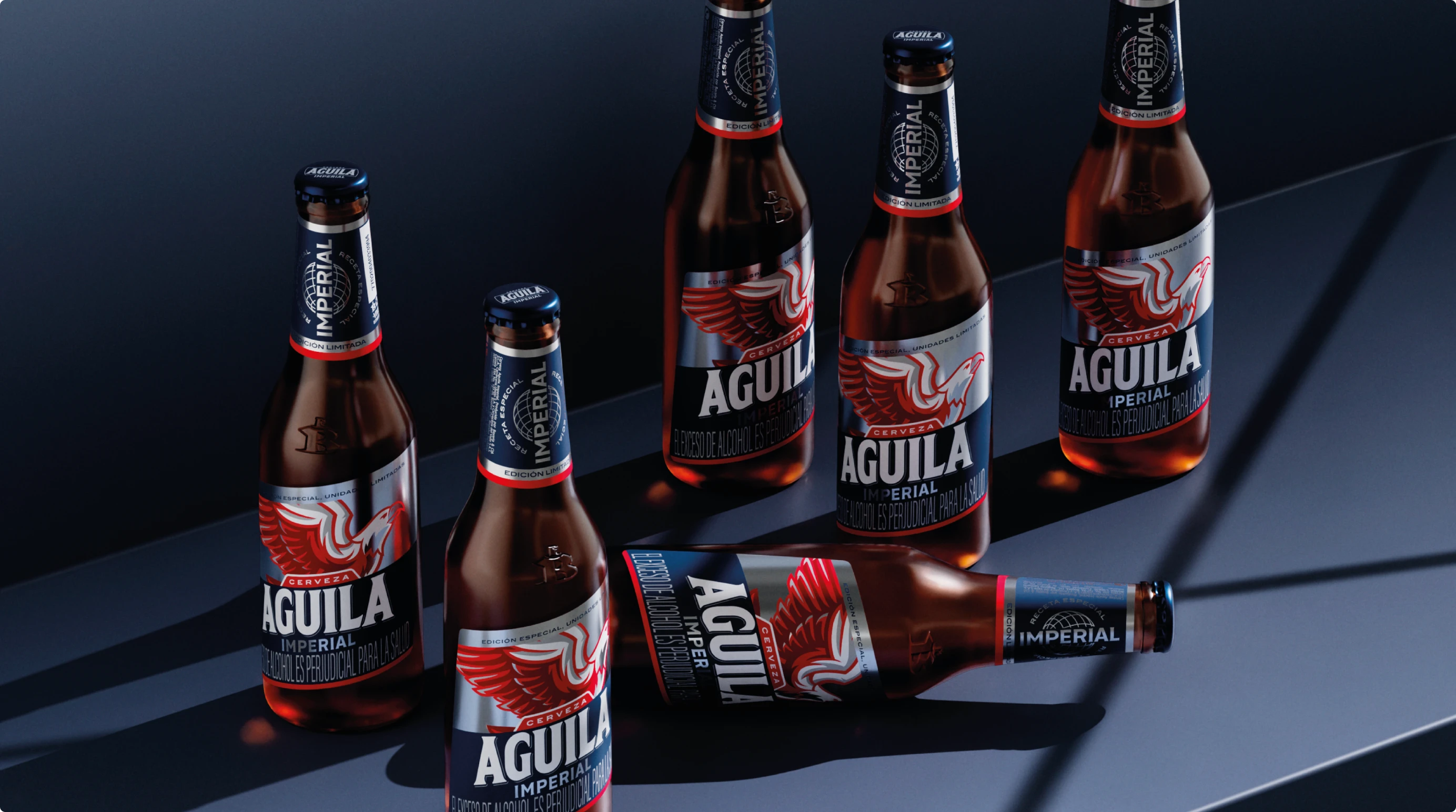
The challenge with the new proposal was to adapt to the packaging system of the brand's latest redesign. Combining modern elements with details that evoke its legacy, using the eagle, symbol of power and pride, as the protagonist of a more dynamic and visually impacting design.
Aguila Imperial has been an emblematic beer for many generations of Colombians, especially at Christmas time, when it is associated with moments of celebration and quality. However, over the years, the product had been discontinued and its packaging had lost some of its emotional connection with the young and modern consumer, facing increasing competition in the market for more premium beers. The brand needed to adapt the packaging system to a higher and more premium reference without losing all the brand personality that had been created.
The solution was to create a redesign that would connect with today's consumer, while maintaining the essence of Aguila as an umbrella brand. We incorporated a contemporary graphic style that enhances the figure of the eagle, with a more aggressive and elegant visual treatment. We used vibrant colors, such as red and blue, to create a distinctive image that stands out on the shelves and evokes luxury and exclusivity. In addition, typography and modern graphic elements were introduced to update the brand, achieving a balance between the traditional and the modern, and reinforcing the idea that Aguila Imperial is the premium beer for memorable moments.


